Walter Climate Diagram Tool Package
Walter Climate Diagram Too Instructions.docx
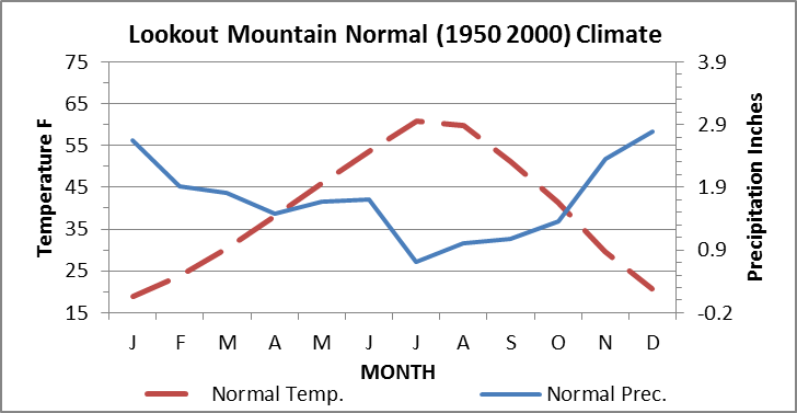
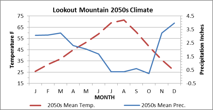
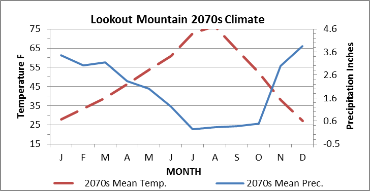
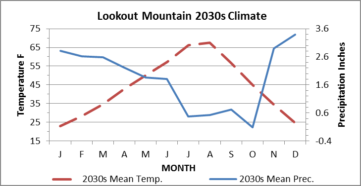
Walter climate diagrams (Walter 1985) were developed to compare seasonal climates among places. Here, we use these diagrams to compare current and projected climates of a single area among the projected climates of future decades. The diagrams show the present and expected future seasonal relationships between temperature and precipitation for a given area of interest. They are assembled to enable biologically meaningful comparisons of how these two key interacting components of climate are expected to change relative to the “normal” (1950-2000), or baseline climate of the recent past. For example, the comparisons can show, among other things, that the length and magnitude of the seasonal water deficit is expected to increase. This would be indicated by the size and configuration of the area in the charts where temperature exceeds precipitation. Additionally, it may show that the summer drought period is expected to become hotter, drier, and longer. At the same time it may show precipitation during the water surplus period is expected to increase. The area between the annual temperature and precipitation curves defines the growing season. The tool is used by resource managers to quantify and visualize future climates of a particular management area relative to the baseline climate. Climate data of North America are built into the tool at a 1 km2 resolution (Donner et al. 2011, Thornton et al. 2017). The user only needs to input a shapefile of their area of interest.
Download the Walter Climate Diagram Tool Package
- Walter_Climate_Diagram_Tool_WGS84_v2_Instructions.docx
- Climate-Data-Metadata.docx
- Future_Clm_Vars_WGS84.gdb.zip
- Present_or_Normal_Climate_Vars_WGS84.gdb.zip
- R6_10-3_MetadataTemplate.xml
- R6_103_MetadataTemplate_esri.log
- Walter_Climate_Diagram_Graphs_Template.xltm
- WalterClimateDiagrams_Tool_WGS84.pyt
- WalterClimateDiagrams_Tool_WGS84.pyt.xml
- WalterClimateDiagrams_Tool_WGS84.WalterClimateDiagramTool.pyt.xml